Editorial design is often understood as a service, the skilled arrangement of text and image to communicate what someone else has written. Typesetting, layout, hierarchy, flow. The craft of making a page readable and visually coherent.
That understanding is accurate but incomplete. The decisions made in editorial design, every one of them, are cultural acts. They encode values, establish hierarchies, and make claims about whose language, whose image, and whose knowledge counts.
The decisions made in editorial design, every one of them, are cultural acts. They encode values, establish hierarchies, and make claims about whose knowledge counts.
The politics of a typeface
Typography is the clearest example. The typefaces available to most designers represent, almost exclusively, the typographic traditions of Western Europe and North America. The history of type design is a history of particular scripts, particular aesthetic values, and particular relationships between written language and power.
Designing a publication for a Hawaiian audience using only those typefaces is not neutral. It is a choice, whether or not it is a conscious one, to frame Hawaiian content within a visual system that was not built for it. The alternatives are not always abundant: Hawaiian language typography is a developing field, and designers working in this space often have to make thoughtful decisions with limited tools. But the first step is recognizing that the decision exists.
Image and representation
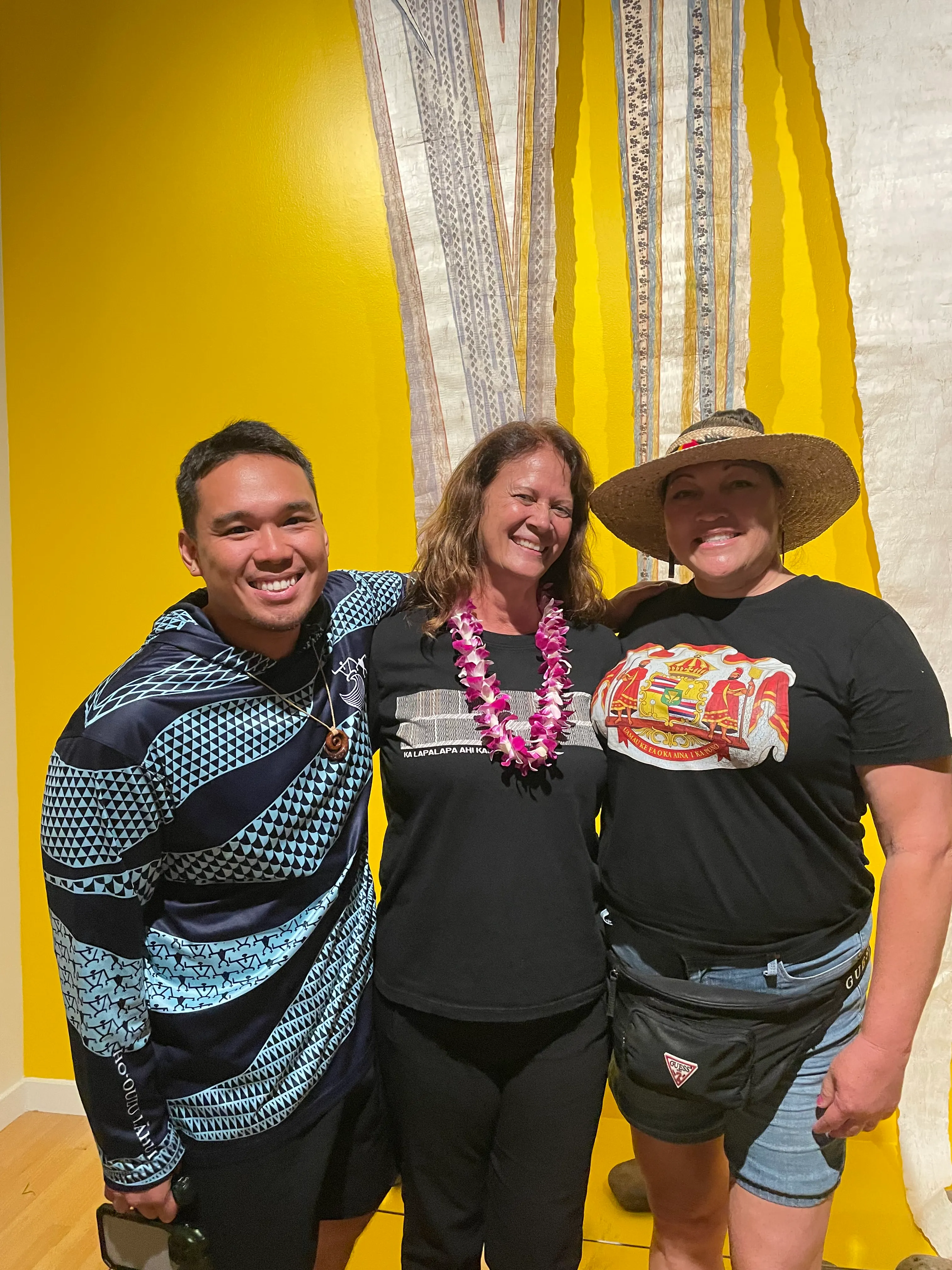
The same principle applies to image selection. Editorial design involves constant decisions about which photographs, illustrations, and visual references appear on the page. In publications about Hawaiian subjects, those decisions determine whose faces appear, what version of Hawaiʻi is presented, and whether the visual world of the publication reflects the community it is for or the assumptions of an outside audience.
Stock photography of Hawaiʻi is a particular problem. Most of it reproduces a specific tourist-facing visual language, sunsets, beaches, generic "tropical" aesthetics, that has very little relationship to the actual visual culture of Hawaiian communities. Using it uncritically in editorial design reinforces that representation, even when the text tells a more complex story.
Language as design decision
In Hawaiian contexts specifically, the presence or absence of ʻōlelo Hawaiʻi, Hawaiian language, in a publication is itself a significant design decision. How Hawaiian language is treated in a layout: whether diacritical marks (ʻokina and kahakō) are rendered correctly, whether Hawaiian text is given visual prominence or relegated to caption size, whether the publication treats bilingualism as a feature or an afterthought, all of this communicates something about what the publication values and who it is genuinely for.
Correct rendering of the ʻokina (ʻ) and kahakō (macron) is not a technicality. They are part of the language. Dropping them is not a design shortcut. It is a legibility failure for Hawaiian speakers and a statement, however unintentional, about what matters.
Editorial design as cultural responsibility
None of this means that editorial design must become purely functional or must abandon visual ambition. It means that visual ambition, in this context, includes the ambition to get the cultural dimensions right, to create publications that are genuinely of the communities they serve, that handle language and image with care, and that use the full range of design decisions available to make something that honors rather than flattens what it is communicating.
That is a higher bar than readability. It is also a more interesting one.